Seattle OPA Web Refresh
Seattle Office of Police Accountability (OPA) Site Refresh
A design, research, and information architecture project to help users understand OPA’s role and services in safeguarding a culture police accountability.
Intro
The Office of Police Accountability (OPA) is part of Seattle’s police accountability system. OPA investigates complaints against Seattle Police Department officers (think Internal Affairs). Anyone can make a complaint. OPA provides independent oversight, supported by a mix of civilian and sworn staff and a civilian Director who makes decisions on allegations free from outside influence.
TIMELINE: The project began in April 2019 and was completed in September 2019. The website continues to be monitored and revised as needed.
My Role
Project Manager
User Research and Testing
Information Architecture
The Problem
OPA has changed a lot in the past couple years, and the web content was outdated. OPA serves two unique audiences- the general public, who can file a complaint of misconduct about a Seattle Police Department (SPD) employee, and SPD employees named in a complaint. The current website is text-heavy with terms and concepts not widely accessible or understandable by public.
Constraints: The website also has design constraints from Seattle IT Web Services that limit design choices to maintain consistency across City department web pages.
Research
AUDIENCES & USERS
General Public: Complainants (past, potential), Community members, Media, Policymakers, Government entities
Seattle Police Department: Employees named in a complaint
METHODS
Public awareness survey (online, in-person)
Web Analytics
User Personas
Competitive Analysis of oversight agency websites
Card Sorts & Tree Tests - Information Architecture
UsabilityTesting.com - current and redesigned site
Design Solutions
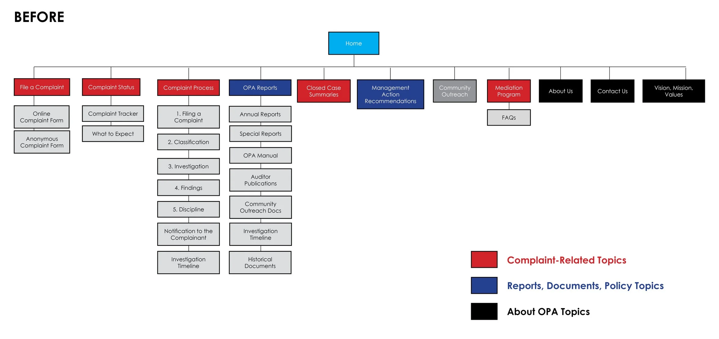
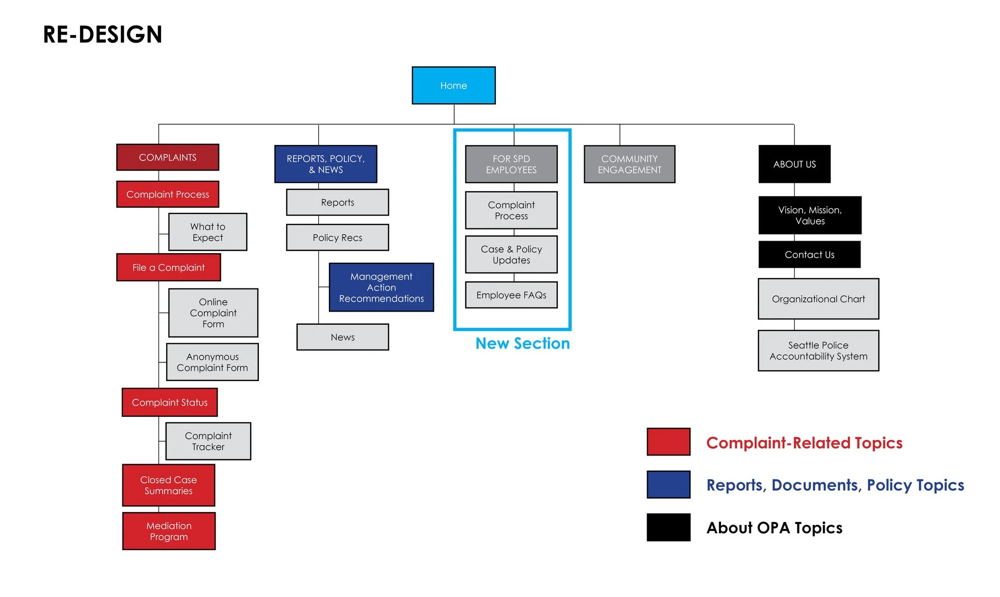
Better site organization through revised sitemap
Improved site findability with new page layout design and navigation design within design constraints
Simplified content to increase user understanding with updated page content to make concepts more accessible to wide audience
Acknowledged different user needs by creating a new section specific to SPD Employees
Project Details:
How we arrived at our design solutions
Design Solution 1: Revised Sitemap
Research Findings:
Difficult to understand categories or level of importance
Users could not easily find information about OPA, or for on-going and high-profile cases
Navigation labels did not help explain content
Through early user interviews it was apparent that the site navigation was not the most intuitive to achieve certain goals. We decided to revise the site’s information architecture and update the sitemap.
Advocating for User Research
Open Card Sort
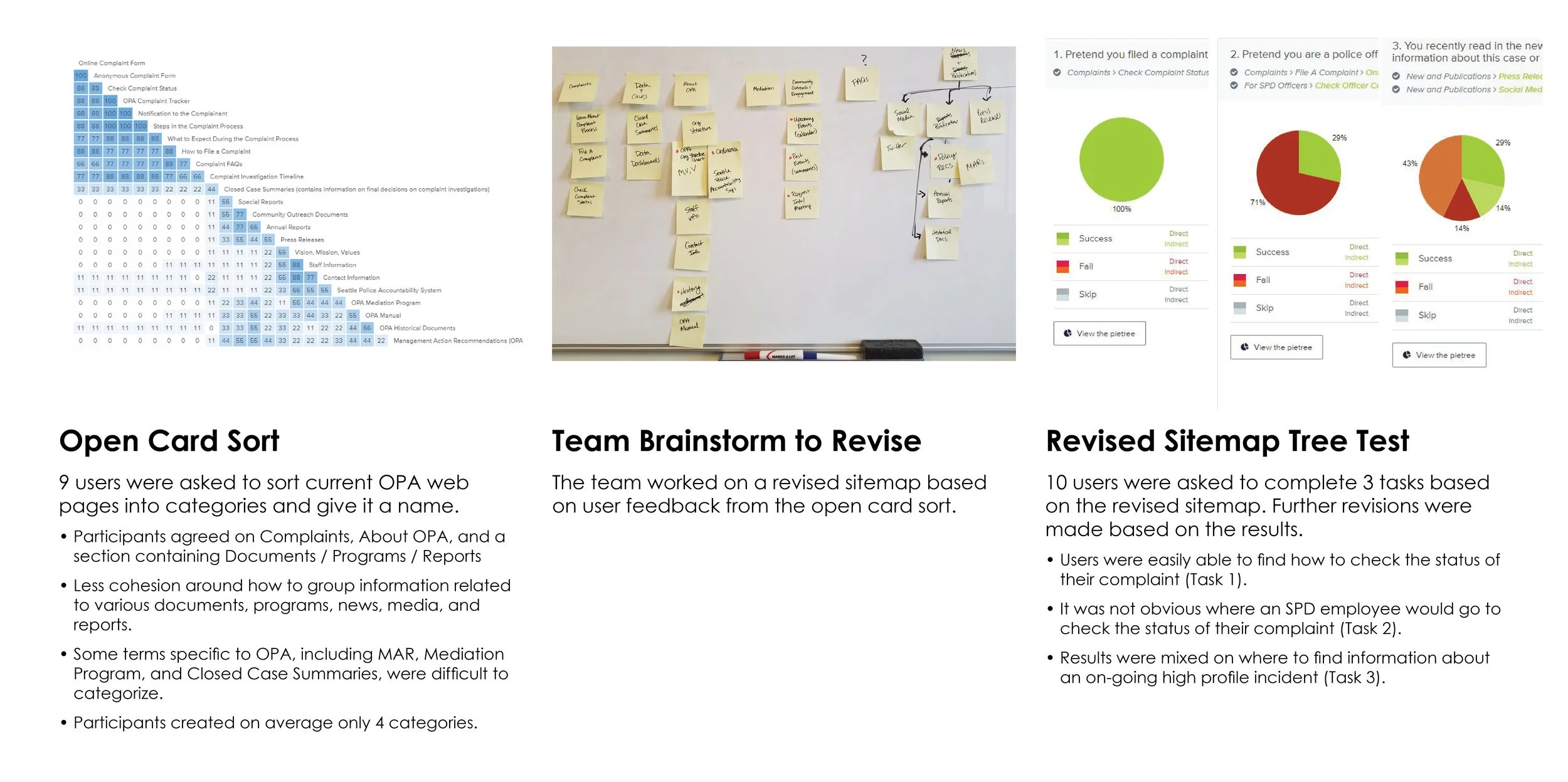
The team was reluctant to do any early user testing. I insisted we get user feedback and asked some friends and family to complete a card sort activity. I also had the team complete the same card sort activity. I then compared the user results with the team’s results to show differences in how users would organize the information and to advocate for the user needs, not internal staff. Two key takeaways from the comparison were:
Users created fewer categories than team members. We made sure to keep the final number of top line categories closer to the total number users created. On average, users created four main categories. The current live website has five main categories.
Users were uncertain of certain terms specific to the work OPA does. We had to make sure that these topics would be categorized in a way that was most relatable to users unfamiliar with OPA’s work.
Tree Test
We then created a revised sitemap based on user input and tested the new structure with additional users through a tree test study. In the tree test, we asked users to complete specific tasks that we were unsure of when revising the sitemap to help clarify how best to organize the pages. The revised sitemap reflects the user input from these two activities.
Design Solution 2: Designing for User Needs within a Limited Platform
We worked with Seattle Web Design Services to update layout and navigation designs to improve findability given the design constraints.
2a: Updated Navigation
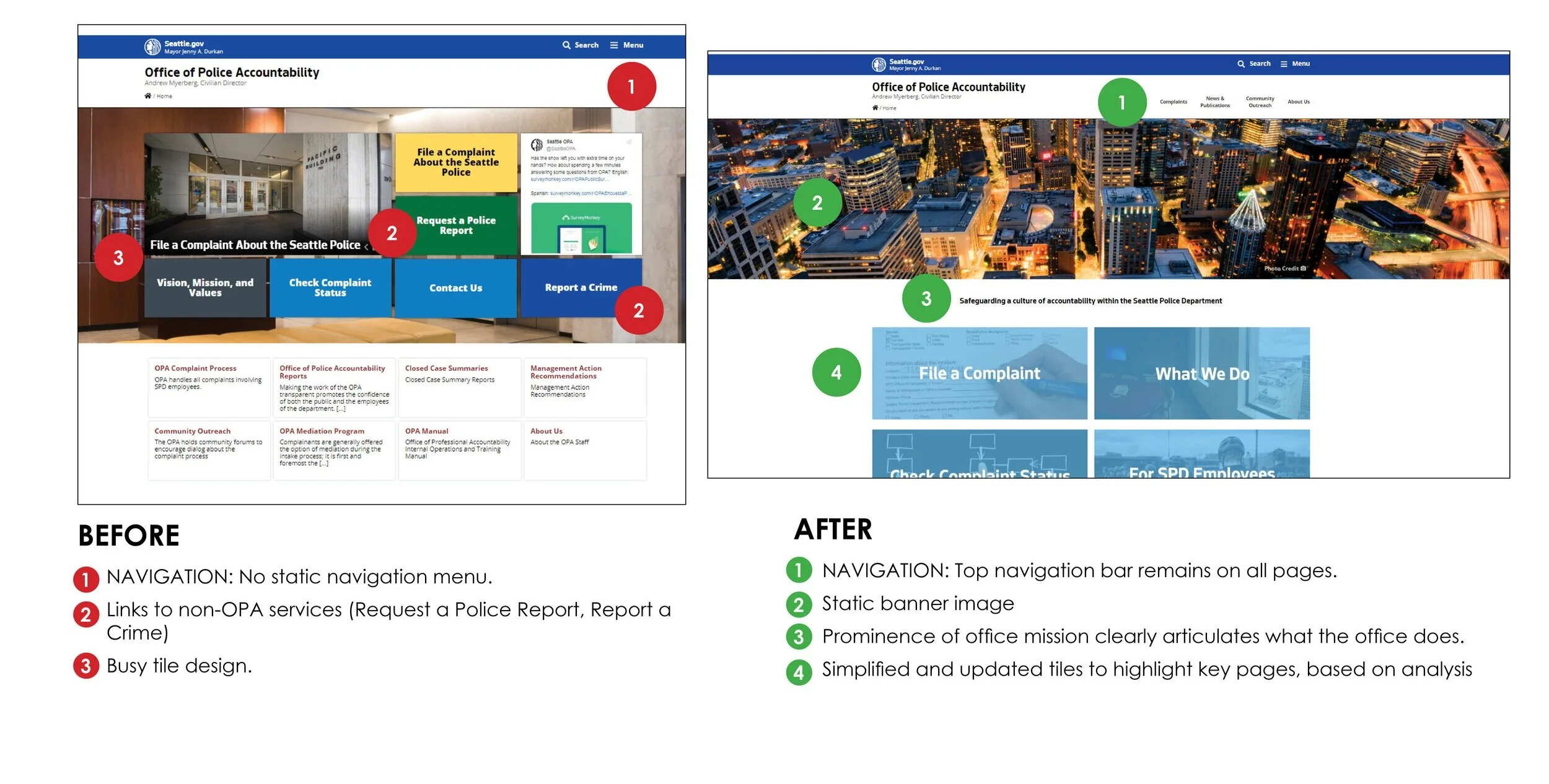
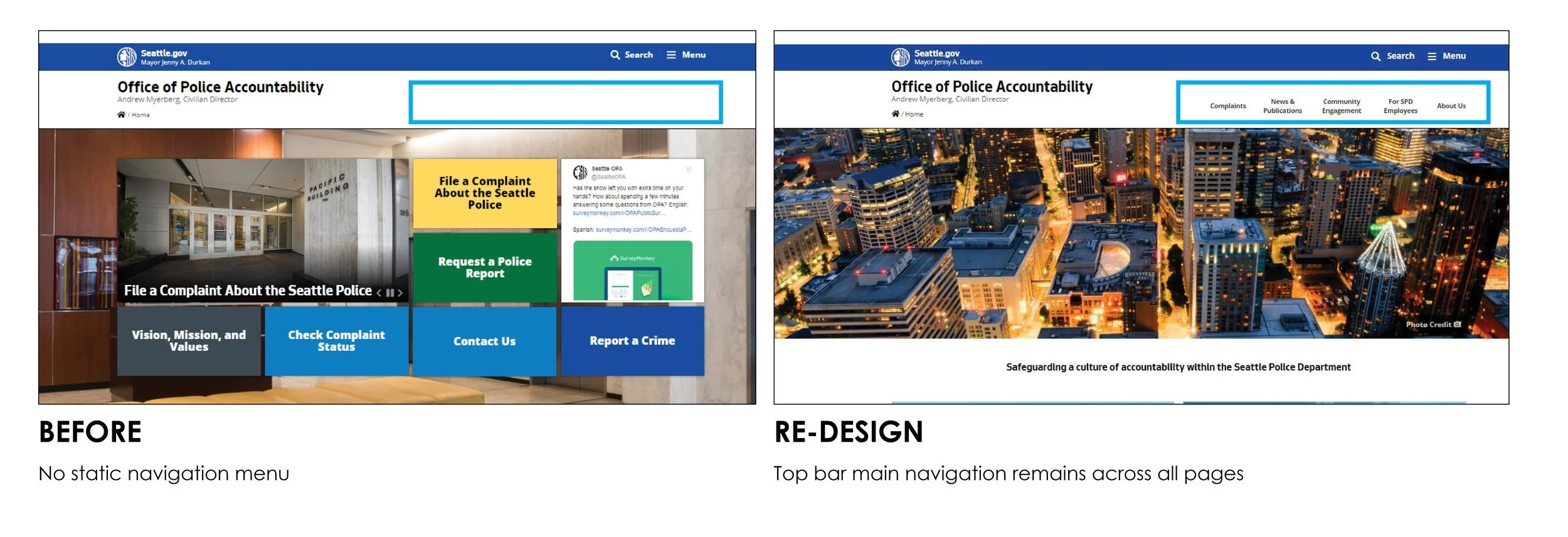
Included a top bar navigation that remains on all pages. Due to design constraints, the top bar navigation does not reveal a drop down menu.
For page navigation, the left side bar was streamlined and font color used to indicate the current page.
Before and after of OPA Homepage navigation.
Before and after of sub-page navigation design.
2b: Updated Layout Designs
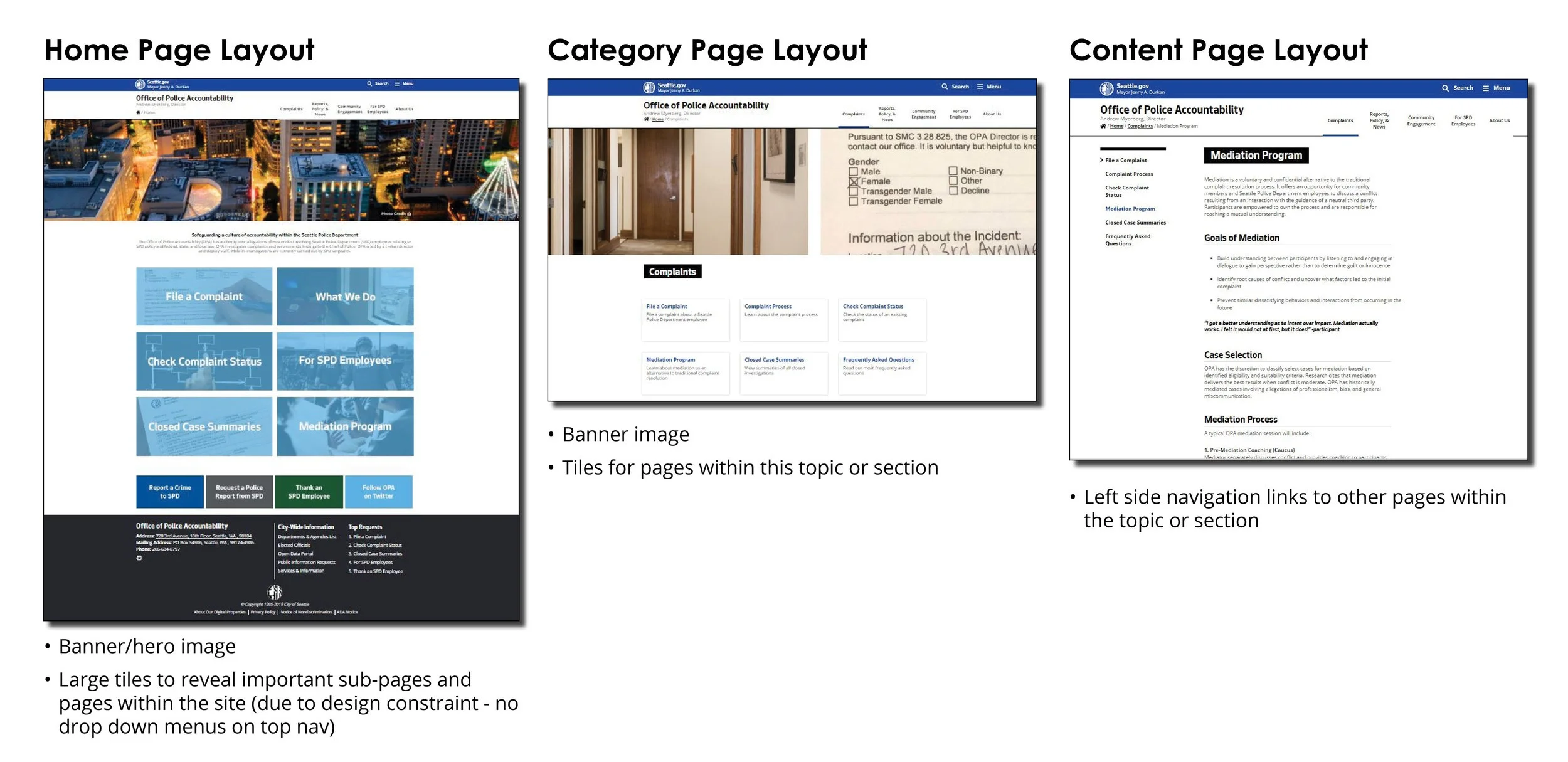
Due to design constraints with the top navigation, there was no option for drop-down menus on the top main navigation menu to show sub-pages. To help orient the user, new page layout designs were used to provide visual cues as to where within the site structure and organization users were. Three distinct layouts are employed according to level within the site hierarchy:
Level 1: Home Page Layout
Level 2: Category Page Layout
Level 3: Content Page Layout
Challenge: Meeting Needs of Different Users
OPA has different audiences. The two main groups are the general public, who may be looking for information or want to file a complaint, and SPD employees who may have been named in a complaint. We created personas to help us understand the different users who would use our site. There are two main user groups- the general public and SPD employees.
Design by Kristina Adams
Design Solution 3: Updated, Accessible Page Content for Public
The team collectively tackled updating content on all web pages. This step included a Content Audit and revisions to ensure technical information about the office’s services and functions are accessible to a wide audience. This was achieved through language changes and making text easy to skim and digestible.
Additionally, we worked to make it easier to understand what OPA is by including its mission statement on the home page, and using more approachable language to make it easier to find information.
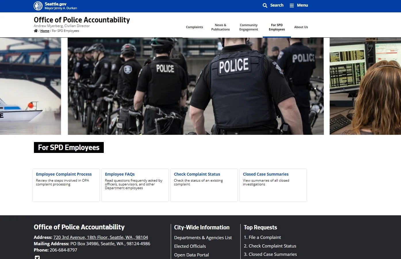
Design Solution 4: Created a ‘For SPD Employees’ Section
Feedback from sworn officers in OPA and from user testing indicated a need for a section specific for SPD employees to find information and updates on complaints they are named in. Our solution was to create a separate section for this user group.
Usability Testing
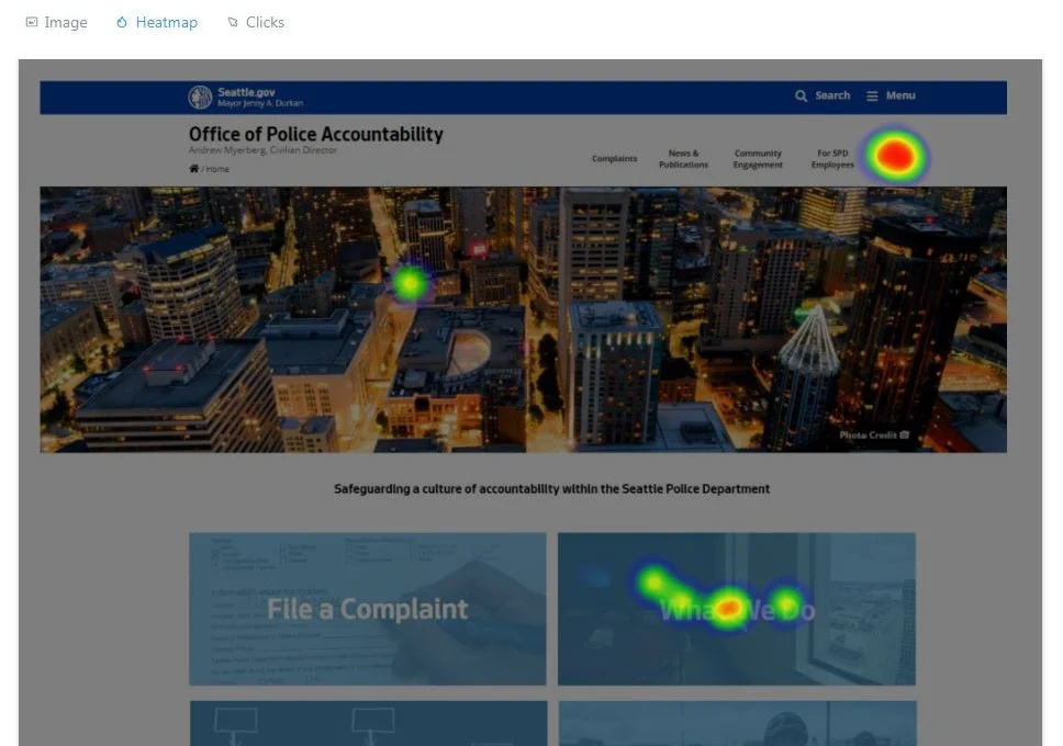
First-click Tests
Online user tests were conducted through Usability Hub to test some of the navigation changes made to the website. 10 users were recruited to complete three tasks for both the original site and the website
Task 1: You are looking to understand what OPA does. From the home page, where would you go to find this information?
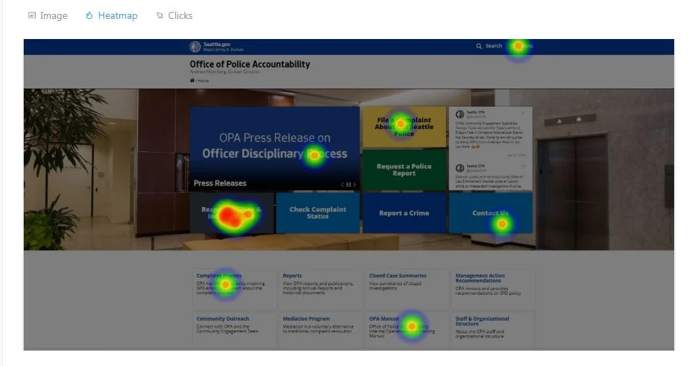
BEFORE: Users testing the original website homepage clicked in many places to find information about OPA.
RE-DESIGN: Most users clicked “About OPA” or “What We Do”, both correct paths to find information about OPA.
“The new website feels much better. The last iteration felt like a big list that someone had just kept adding to, they hadn’t prioritized or separated tasks correctly.”
Lessons Learned
I learned about the importance of advocating for UX (and sometimes just doing it, even when told no). Due to Seattle IT constraints, next time we would work to better understand role of constraints, if any, earlier in the design process.
Next Steps: Should our team continue to iterate on the web design, some things to focus on include:
Further refinement needed to help users (public and SPD employees) find information about a specific closed case or ongoing case
Further accessibility improvements with a text-heavy site
OPA is launching a complainant experience evaluation


